Following on from the Random Trading Strategies post, I’m exploring the characteristics of the markets and looking holistically across all of the data. To do this, I’ve added an Analysis Strategy to the Backtesting Engine which reports market statistics to ElasticSearch and I’ll use Kibana for visualisation.
I’m going to visualise the following categories across Forex, Indices, and Crypto:
| Categories | Comment |
| Close Price | Visualising the Daily Close Price |
| Day Range | Difference between the daily High and Low price |
| Price Movement | Difference between the previous and current price tick, with an average taken over the day |
| Price Gaps | Difference between the previous close price and the next open price. A positive gap corresponds to a higher opening price than the previous closing price (and vice versa). In most cases, the price is continuously gapping across all markets tested (Forex, Indices, and Crypto). |
| Average Spread | Difference between the Ask and Bid price, averaged across the day |
| Daily movement | Accumulate the difference between previous and current price tick values, reset the counter daily |
Foreign Exchange Markets
- EUR/USD, GBP/USD, AUD/USD, NZD/USD, USD/JPY, USD/CHF, USD/CAD
- 17 years of tick data (2004 - 2021)
Close Price

I’ve hidden USDJPY from the chart as it’s a currency pair that is in hundreds compared the decimals of the other currencies, which makes it hard to display both at the same time.

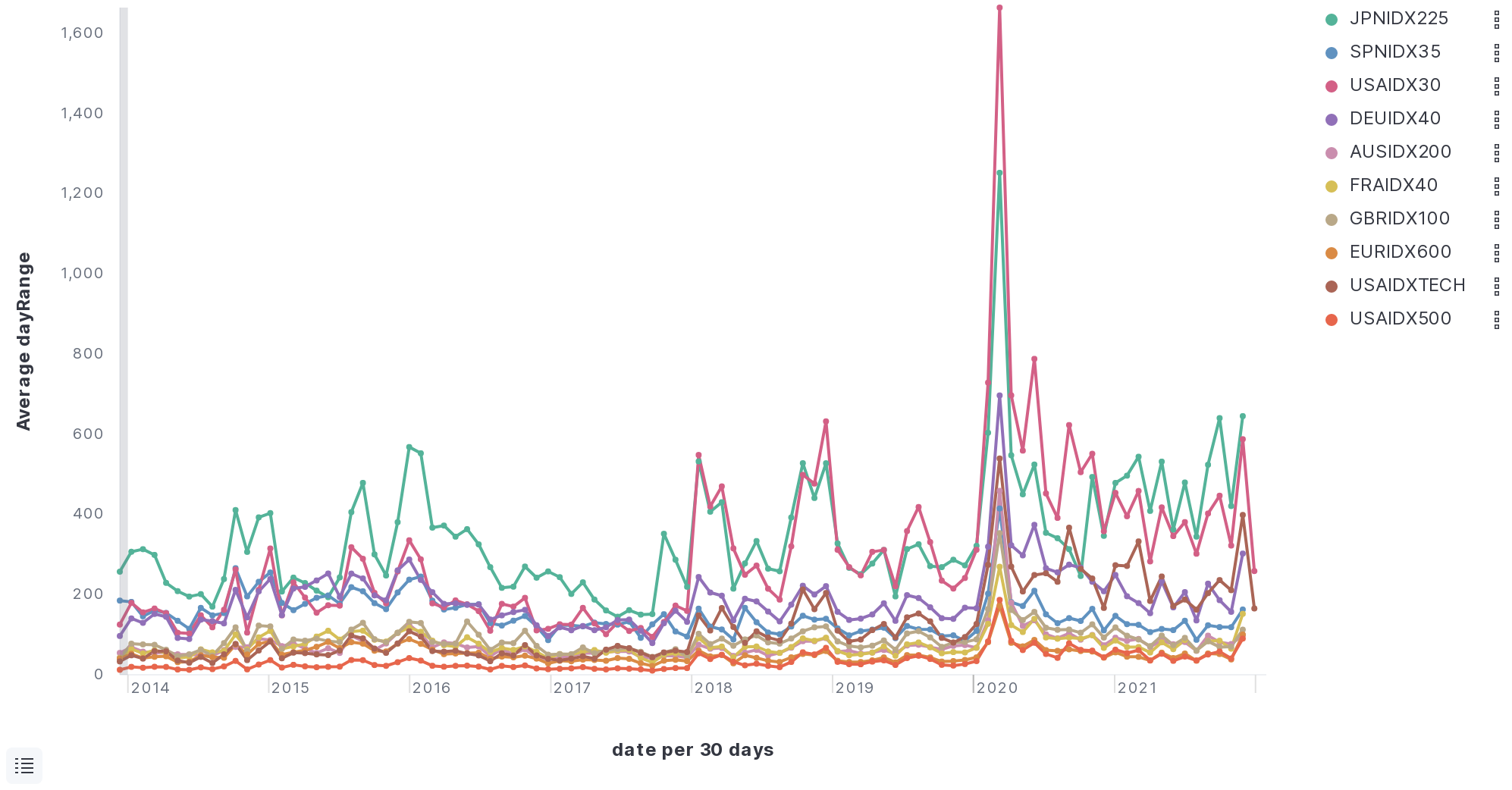
Average Day Range
The average day range subtracks the daily high and low.

Average Distance Between Ticks
This is a record of how big the gaps are between ticks (in a Percentage In Point).

You’ll see that the distance between ticks reduced around 2010, potentially due to the increase of HFT (High Frequency Trading).
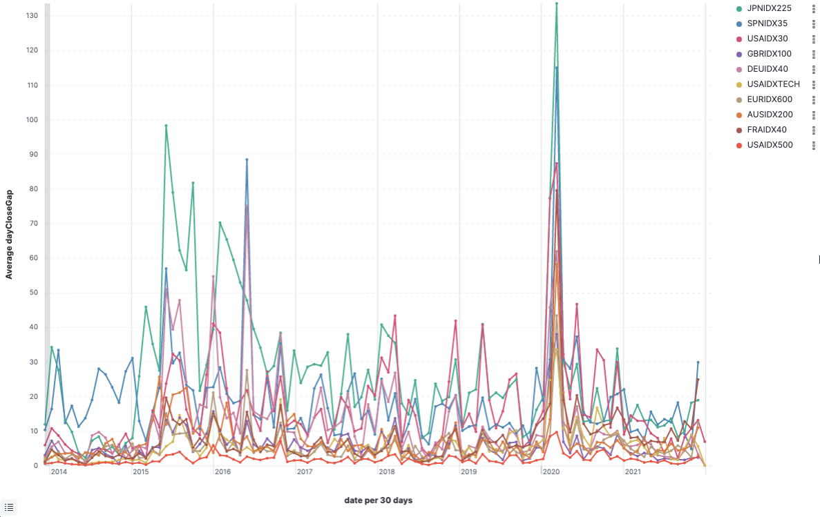
Daily gaps
The gap between the daily close, and the next open. I’ve built a OHLC class in the backtesting engine to build and track Open, High, Low, Close, on any time scale.

There was an average of 3 PIP gap for all of the currencies tested over the 17 years, with various peaks throughout (periods of volatility)
Noteable events:
- Average of 22 PIP gap in August 2008 following the 2007 financial crisis
- Average of 24 PIP gap for the GPBUSD in July 2016 following the Brexit vote
- Average of 10 PIP gap during 2020 COVID-19 crisis
Spread Average

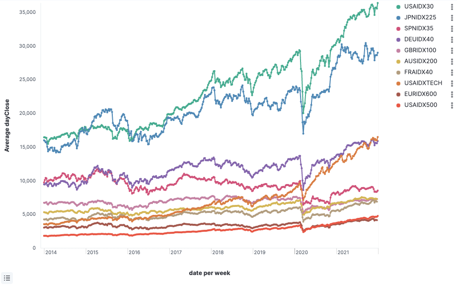
Indices
I’ve analysed tick data from ten Indicies from USA, Europe and Asia.
Specifically, STOXX Europe 50, UK FTSE100, USA30, S&P 500, NASDAQ, S&P/ASX 200, DAX, CAC 40, IBEX 35, Nikkei 225 over the last 7 years, using tick market data between 2014 and 2021.
Close Price
The Indices appear to have similar movements with a drop in value during 2020 across every index.
Daily movememnt
There was a significant change in daily price movement during 2020.
Average movement between ticks
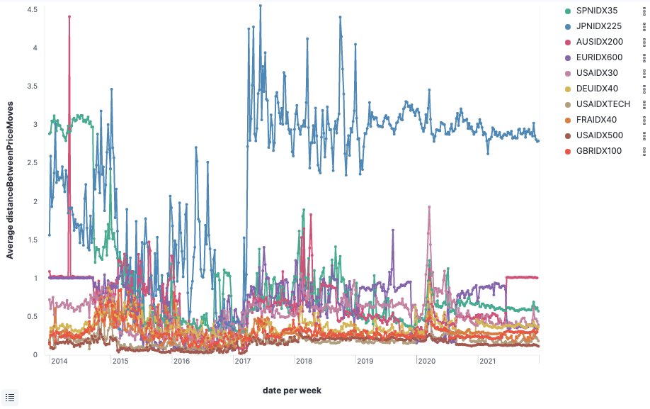
The above chart shows the average price movement for the 7 Indices between ticks. The above graph ilustrates a higher price movement of more than 3 PIP’s of movement for the JPNIDX225 which reinforces my theory of why the above random run above was much worse for JPNIDX225.
Daily Gap
The table below documents the 7 year gap average for each Index. There were various periods volatility during during 2006, 2008 and 2020.
Spread Average

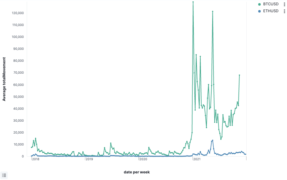
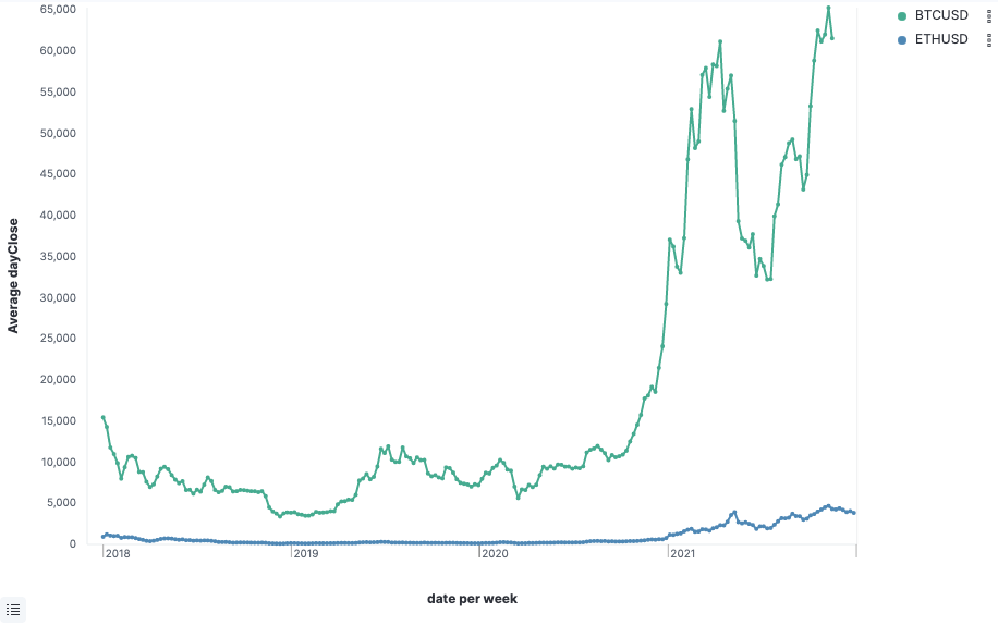
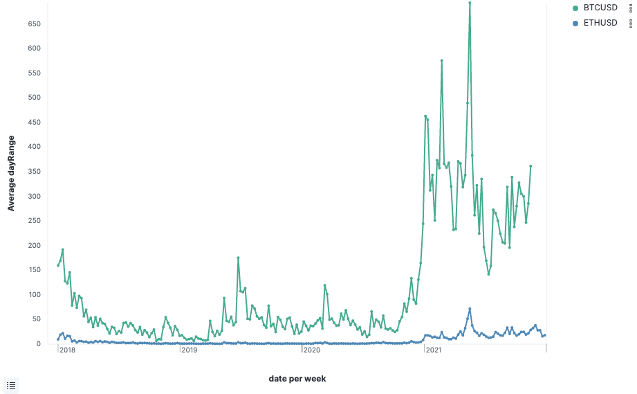
Cryptourrencies
I’ve analysed tick data from the last three years (2018 - 2021) of two Cryptocurrencies, BTCUSD and ETHUSD.
Close Price
Day range
Total Movement
Cryptocurrencies don’t have a market close like Indices and Forex, however, there are frequent gaps as the market traders determine the price of the cryptocurrency. Instead of mapping a daily close-open comparison, I’ve visualised the total movement of the cryptocurrencies over the last 3 years.